
 By Freddie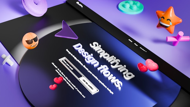
Embracing Minimalism in Web Design
The principle of minimalism guides modern web design. Sites now strive for clean, intuitive layouts that focus solely on the essentials. Each element, from navigation to visual accents, serves a distinct purpose, stripping away anything unnecessary to create a frictionless, user-first experience. The approach favors open spaces, subtle animations, and a judicious selection of content, thereby improving usability and amplifying visual impact.
This movement has paved the way for the rise in minimal UI frameworks that prioritize clarity and usability. The goal is to help users focus on content without getting lost in clutter, making websites both beautiful and accessible to a wider range of audiences.
Incorporating Bold Colors
While minimalism emphasizes restraint, the use of bold and unexpected colors has emerged as a key trend for 2026. Designers embrace strong hues not to distract but to inject personality, highlight actions, and foster stronger brand recall. By restricting a palette to just a few vibrant selections, creators draw attention to essential elements and accentuate calls to action, all while preserving the elegant simplicity that is the hallmark of minimalism.
For example, a carefully chosen splash of electric blue or radiant coral can guide user attention to critical features like “Sign Up” buttons or important notifications, enhancing the site’s effectiveness without overwhelming the user. Bold colors not only invigorate minimal layouts but also keep digital experiences memorable and distinctive. As noted in industry reports, this careful balancing act is essential to modern web strategy.
Experimental Typography
Typography goes far beyond classic, reserved font choices. Designers are opting for dramatic, custom typefaces, playful letter forms, and animated text to elevate branding and engagement. These typographic treatments act as design centerpieces, merging art with communication. Whether it’s oversized headers, unique variable fonts, or kinetic text, typography establishes voice while supporting the clarity and intent demanded by minimalist principles.
Experimental fonts and typography styles serve the dual role of grabbing attention and conveying tone instantly, giving even the simplest layouts a distinct, signature presence. Animated typography adds a further layer of intrigue, drawing the user’s eye in a subtle, non-disruptive way. For more on current typography shifts, refer to recent analyses by Creative Bloq.
Responsive and Mobile-First Design
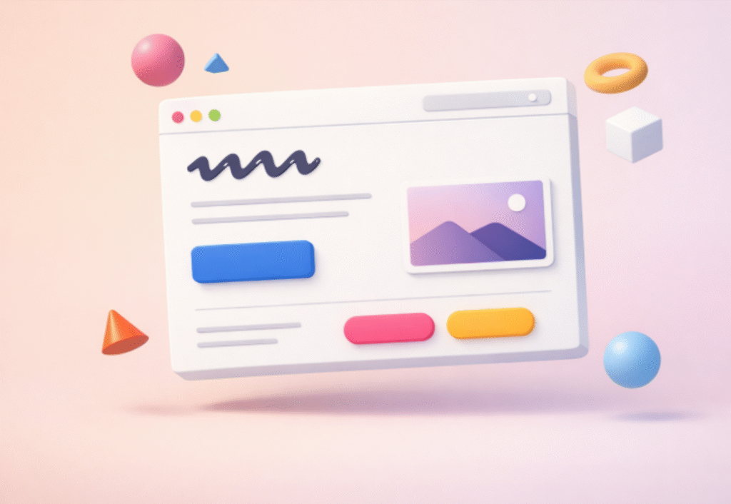
With the majority of web traffic now coming from mobile devices, designing for flexibility and scalability is non-negotiable. Responsive and mobile-first approaches mean layouts must adapt smoothly across different screen sizes, resolutions, and orientations. Key mobile design cues include streamlined navigation, touch-friendly elements, and rapid load times.
These strategies ensure users remain engaged wherever they are, reducing friction and bounce rates. Mobile-first design is no longer an optional enhancement; it is a standard expectation. The biggest brands and innovators work diligently to fine-tune layouts and interactions for handheld devices before considering larger displays, underscoring this trend’s significance across industries.
Dark Mode Options
The inclusion of dark mode has become a mainstay on modern websites. Allowing users to toggle between light and dark backgrounds not only enhances individual comfort but also improves accessibility, especially in low-light conditions. Dark mode reduces eye strain, conserves battery on OLED screens, and offers a fresh visual alternative that aligns well with minimalist motifs.
Designers pay special attention to contrast and readability in both modes, maintaining brand consistency while ensuring optimal legibility and a satisfying user experience, regardless of ambient lighting preferences. This feature demonstrates a commitment to user-centric design and inclusivity.
Integrating 3D Graphics and Illustrations
To counterbalance flatness in minimalist interfaces, 3D graphics and custom illustrations are increasingly appearing on websites. These enhancements add depth, personality, and encourage interaction without clutter. Subtle parallax effects, interactive 3D elements, and hand-drawn visuals help tell stories, direct user flow, and distinguish companies in competitive markets.
By integrating 3D elements, designers keep minimal layouts dynamic and approachable. Users benefit from an immersive, engaging atmosphere, experiencing sites in new and memorable ways while still enjoying the fast performance and ease of use that minimalism offers. For more inspiration, see recent showcases by Awwwards.
Conclusion
The advancement of minimalist web design in 2026 is all about striking a harmonious balance, reducing noise while injecting personality through bold color, innovative typography, and lightweight interactive features. By respecting users’ need for clarity, flexibility, and comfort, today’s designers craft digital experiences that are both visually compelling and highly functional. Staying true to minimalism while embracing select enhancements prepares websites to stand out and serve audiences more effectively in a competitive digital landscape.